*On a side note, Blogger has added new template options... very exciting! So, you may see my site changing around a bit as I play with everything. Feel free to let me know if you like/dislike any of the changes. :)
Ok, so back to business. I had the opportunity to sit in on a fabulous Ken Downing runway show at the Neiman Marcus in Paramus this week. First, I love Ken Downing. He is amazing! And, two, he broke down one of the biggest trends with some simple, short and very easy to follow advice.
Bold color and color blocking go hand in hand this season. Bold color is important as an accent for the neutral lovers out there and it is just as fabulous when put together with other bold colors for the more adventurous fashionista. Or, you can happily settle somewhere in the middle and add touches when and where you feel comfortable.
The only challenge is how to mix up the bold colors, and how do you know which is the right bold color to add? First you have to take your coloring into account. Only you know the colors the make your eyes pop. And two, stick to color families - cool tones or warm tones. It makes things so much easier and and the colors blend better. This helps to achieve a more polished look.
Ken's advice builds on these initial concepts. For warm tones... reds, pinks, purples... imagine roses. All of the colors that blend together. Even a painting would work. The way the artist blends different shades of the same color. For cool tones, think of a peacock feather. The deep blues, greens, teal... sometimes a bright blue - so gorgeous, right?! Use these image to help pick the colors that you would wear together. You shouldn't stress too much about things being perfect. As long as the color combo is pleasing to the eye, and the colors look like they belong together you are going to look super chic!
Ken's main focus was on the red and pink family. He is obsessed with burgundy this fall. He even created a lip and nail color exclusive to Neiman's! However, the cool tones are still big as well as other color families. It really all depends what colors you prefer and what your comfort level is with color.
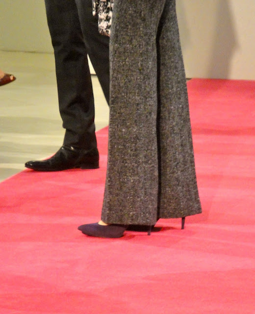
Another trend that you may pick up on in these photos is "Lady Chic". The polished, put-together look is very important this season as well. I will touch on that later, but when putting together your colorful ensembles; keep in mind that the look is very tailored right now... very Grace Kelly meets the 70's!


No comments:
Post a Comment